In the vibrant world of Parched Crow Wines, I embarked on a captivating rebranding journey that seamlessly intertwined artistry with the essence of the Hunter Valley.
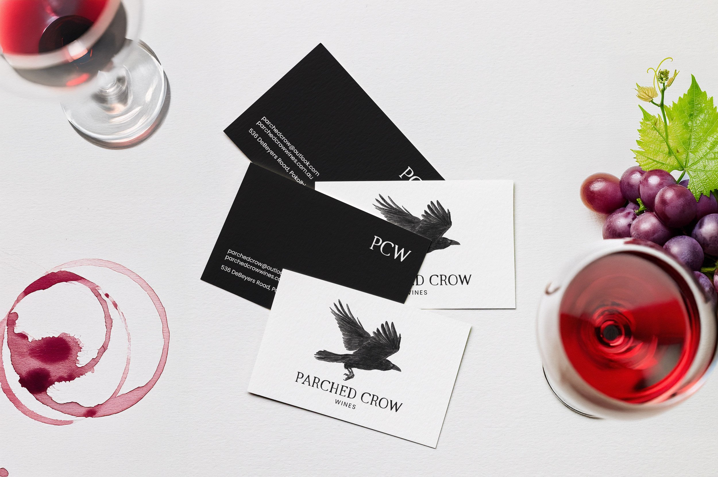
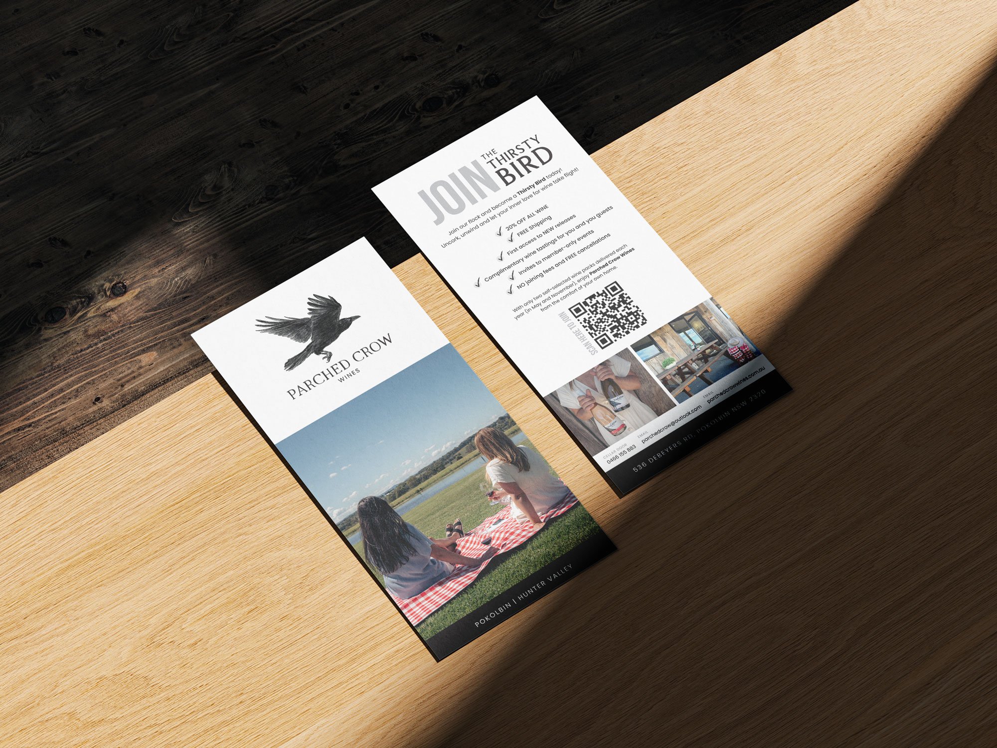
Tasked with the challenge of creating new, timeless wine labels under a tight deadline, I collaborated closely with the winery to unveil a distinctive visual identity. The focal point emerged as a hand-drawn illustration, a graceful crow soaring above rustic, serif typography—an embodiment of the winery's spirit. Infused with a personal touch, I incorporated my handwriting and a bespoke illustration of the Hunter Valley mountains, a homage to the very landscape that inspired this artistic endeavor during my visit.
The result is more than labels; it's a testament to the marriage of creativity, passion, and the unique stories that each bottle of Parched Crow Wines whispers to its beholder.


